Thursday, December 11, 2008

The Final Touches on my Final Project for the Final Class of 2008

Here it is. A few minor adjustments (they appear minor, try making them yourself. For the amount of time it took me, I'll call them major) and I've successfully completed my Claddagh series. I enjoyed making such a personal piece. I have a claddagh necklace that my Grandmother left me after she passed, so the symbol and what it represents mean a lot to me. After my best friend died in a fishing boat fire, I had the symbol and his name tattooed on my back. So in its own way, working on and completing this project was therapeutic and helped me reflect on the friendship, loyalty and love of those two special people and everyone else close to me.
________________

^
Jerry, George, Cosmo Kramer and Elaine were all close friends who spent a lot of time sitting down, having coffee and talking.
_____________________

^
You wanna talk about being loyal, giving your life for someone or something is as loyal as it gets. Be sure to thank Veterans of Foreign Wars for their service
_____________________

^
Carving it in a tree says a lot more than a text message or an e-mail.
________________________

^
The Whole enchilada

FIN

Wednesday, December 3, 2008

So these are my rough drafts for my independent project. My concept is the Claddagh (friendship, loyalty and love). I came up with new ideas for friendship and loyalty. I also decided to use watercolor paint and charcoal pencil for a medium. At first I was satisfied with these pieces but after some time, i can nit pick some changes that i would like to make.

^
Friendship
^
Loyalty
^
Love


Thursday, November 20, 2008

final scetch ideas

For my final project I have chosen to base my series of pieces on the Claddagh. The claddagh is a very old Irish symbol that represents 3 core values of successful relationships. Those values are: Friendship(symbolized by two hands), Love(the heart), and Loyalty(the crown). The symbol made its way across the globe via migrating Irish people from the Potato Famine. The claddagh is most commonly seen in jewelry.
my web chart
---------------------------------
This is what i came up with to represent friendship, a little boy and his dog on the beach
---------------------------
I decided to use the old fasion tree carving to represent love
--------------------------
For loyalty, i chose the most loyal thing possible(in my eyes) the unknown soldier monument. You cant get much more loyal than someone sacraficing their life for their country, without anyone knowing who you were.

Thursday, November 13, 2008

Batik Project and Examples of Texture

simulated texture
This is a batik that looks cracked and swirled but in actuality it is a smooth surface.
--------------------------
invented texture

Van Gogh's adaptation of wind, moon, and star light is portrayed in this famous oil painting. There is no actual texture to these things but through imagination and creativity Van Gogh uses an implied texture to capture them.

--------------------------
actual texture
This is a Chuck Connolly painting. Chuck is known for using tons of paint on his canvas. Layers of paint and the way his brush moves through those thick layers of paint create a physical texture you can touch .
------------------

abstract texture

-----------------------


my batik:
It was a wild and humbling journey. When i started working on it at home i think i may have heated the wax too much, causing it to not work the way it did in class. Some of the die colors were not protected by the wax, causing excessive and involuntary bleeding. If my project were an Olympic figure skating routine and i were a judge, i would give my project an 10 for effort, 10 for degree of difficulty and a 6.8 for execution.


Wednesday, October 29, 2008

Color Theory and Interaction


Peter Max is known as a Neo Fauvist/ Expressionist painter. He uses color brilliantly in the paintings I researched.


This One here is called two vase of flowers
___________________________
I wanted to base my work on Peter Max's style but once I got going, this project took on its own style. I have always enjoyed the shapes and the character of fire hydrants. They kind of look like little people, so i took this photo of a hydrant...


Then i tweaked the picture in photo shop to bring out the shapes made by light and shadows.


It came out wicked pix elated and not as clear as i wanted...


So I printed it out, put it on my light box and outlined the basic shapes of the hydrant. After i got the hydrant right, I added some more shapes of my own to create some form.


Then I colored in some shapes in with a black sharpie.


Then I colored in some shapes with the three primary colors. For some reason this piece would not scan, sorry for the whack camera phone pic. I did my best.


This color scheme is similar yet different in its own way. I took the primary colors and swapped them for less intense colors.


For this one I went for 5 different High contrast colors. Crimson and Navy Blue (Dominant), Light Blue and Green (sub dominant) and Yellow (accent colors)


Thursday, October 16, 2008

Value

These are three of the photos i took for the body as a landscape assignment.
You'll have to excuse my lack of photography skills and crappy camera phone.
I do think i did accomplish the whole paradox concept.


Above is the one i like the most. I will use this for the class critique.


For my color project I listened to a Beastie Boys Root Down single that has various remixes of the track (this is based on the "FreeZone mix". The song is an ode to everything hip hop-rapping, graffiti writing, clothing and break dancing.

Because they are from New York, I wanted to base my art on a New York artist from the 80's. So i based the figures on Keith Herring's.


I used green water color and adjusted value and intensity by adding black or white paint and water. Its three upside down break dancers if you couldn't gather that on your own.


Wednesday, October 8, 2008

Form Space Motion

For this assignment i sought inspiration from photographer Alexey Titarenko. He's quite the pro when it comes to photography and capturing form from one and two point perspective. He has mastered adjusting the camera's shutter speed to capture implied movement.

_____________________________________________________________


_______________________________________________________________


I also enjoyed the piece that was also on our class blogg titled, "The Red Tower". Its a simple 1 point perspective painting that uses simple shapes, shadow, and fading color to create implied space.


___________________________________________________________________


Here's what i came up with. I tried to take something from each of the above examples.


I'm not much of a photographer but i did the best i could. I wanted to use 1 point perspective, implied space with the staircase, and capture a moving car. After several tries i finally caught a white minivan zooming by.

Tuesday, September 30, 2008

shape project

Here are some pieces that i was interested in as far a shape goes. I enjoy the simplicity in the first two and the balance of value in the third.


these are my three black and white compositions. I created them on Adobe Illustrator, and although my skills are very young, they are improving. What i was really going for here are basic shapes, simplicity and a balance of black and white.


Untouched i think the three pieces are successful. When I printed them and got the scissors out, all hell broke loose and i laid an egg, dropped the ball, bombed, you name it. I ran out of time and this is what i got, sorry...


well folks this is why i have to go to art school, if i already knew how to do it, i wouldnt need to be here.


Tuesday, September 23, 2008

Line and Form

I am the biggest beastie boys fan you will ever meet, guaranteed, you wanna battle, you must be crazy. It took a while for me to wrap my head around the idea of this assignment and of course the answer to my dilemma is tacked up on my wall and resting on my bookshelf as well.


The artist I chose to research is Matteo Pericoli. His Drawing "Manhattan unfurled" was done with black pen while riding the ferry along the Manhattan east and west coast. It is printed in an accordion style book that unfolds 32 feet long. The Beastie Boys chose a portion of this work for the cover of their 2004 album which was dedicated to the resilient residents of New York City (their home town) titled, TO: The 5 Boroughs.

Album cover
__________________________________________________


Other Pericoli NYC sketches

___________________________________________________


Pericoli's "The Hill"


__________________________________________________


I based my drawing on the lower of the three Minneapolis drawing.
______________________________________________________


Same point of view as some of Pericoli's stuff so I figured i could take over from here. My Photo shop skills are still in the early stages so i based my free hand drawing on this photo and Pericoli's style.


Monday, September 15, 2008

Form (Harmony and Pictoral Movement) Research

The first artist that comes to mind when i think of form, for some reason i think of Rembrandt, probably because he really had a good grasp of the idea.
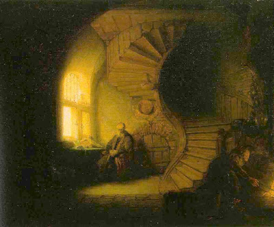
The contrast of the light from the window attracts the viewers eye to the left side of the spiral staircase. This line is "S" shaped, wavy making it more playful for the eye than a straight line.
We see repetition with the steps and also with the arch shaped window, ceiling and arch shaped small door. The twist of the spiral staircase also creates arch shapes.

________________________________________________________________________

The "topic card" i picked was Impressionism, so i decided to study the form of some famous Impressionist artists pieces. Claude Monet is one of my favorite painters and I usually pay more attention to his use of color than form.
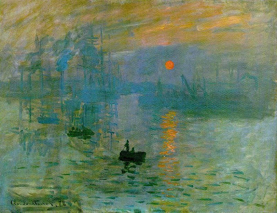


As a whole, Impressionist paintings are simple when it comes to brush stroke technique, detail is not imperative. Choppy strokes of color overlapping other colors creates forms of boats, people, water, and a reflection.
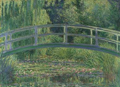


At the time of this movement new technology in art such as oil paints in tubes and retractable easels, made it easier for artists to work outside. Most Impressionist art is done outdoors.
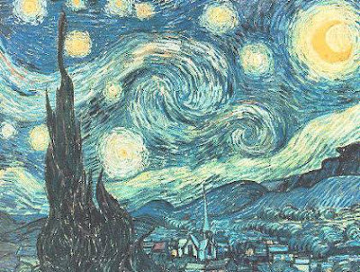


This is one of the most recognisable Impressionist pieces around. Van Gogh's Starry Night. He uses more imagination than accuracy here. We see use of repetition, playful lines and texture.

______________________________________________________________________

This is the piece of paper I was given to base my Impressionist work on, Yippee...

I fought with this assignment for quite some time. I went out and got a primed canvas, cut it from 9'x12' to 8 1/2 x 11 then cut a hole in the top left corner of the canvas board to represent the hole left from the hole puncher on this paper. Long story short, i got real frustrated and the impressionist piece i painted is no longer with us. It is destroyed and i literally went back to the drawing board using pastels rather than paint.
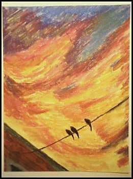


Since the impressionists were going outside and painting pretty pictures of Lily pads, gardens and landscapes in their area, i decided i needed to create something i see in nature. However, there is not much colorful nature on D and west 6th street in South Boston. The sunset and the sky rats (pidgins) in my neighborhood are the closest things to pure nature I'm going to find. And that will do just fine for me.
I used the lines I had to follow as a building and a electrical/phone wire. I used the rest of the open space to create harmony with color and movement. You may notice repetition in the shape the bottom left edge creates with the window, three sky rats, and also i revisited the shape of the birds in the clouds as well.