Wednesday, October 29, 2008

Color Theory and Interaction


Peter Max is known as a Neo Fauvist/ Expressionist painter. He uses color brilliantly in the paintings I researched.


This One here is called two vase of flowers
___________________________
I wanted to base my work on Peter Max's style but once I got going, this project took on its own style. I have always enjoyed the shapes and the character of fire hydrants. They kind of look like little people, so i took this photo of a hydrant...


Then i tweaked the picture in photo shop to bring out the shapes made by light and shadows.


It came out wicked pix elated and not as clear as i wanted...


So I printed it out, put it on my light box and outlined the basic shapes of the hydrant. After i got the hydrant right, I added some more shapes of my own to create some form.


Then I colored in some shapes in with a black sharpie.


Then I colored in some shapes with the three primary colors. For some reason this piece would not scan, sorry for the whack camera phone pic. I did my best.


This color scheme is similar yet different in its own way. I took the primary colors and swapped them for less intense colors.


For this one I went for 5 different High contrast colors. Crimson and Navy Blue (Dominant), Light Blue and Green (sub dominant) and Yellow (accent colors)


Thursday, October 16, 2008

Value

These are three of the photos i took for the body as a landscape assignment.
You'll have to excuse my lack of photography skills and crappy camera phone.
I do think i did accomplish the whole paradox concept.


Above is the one i like the most. I will use this for the class critique.


For my color project I listened to a Beastie Boys Root Down single that has various remixes of the track (this is based on the "FreeZone mix". The song is an ode to everything hip hop-rapping, graffiti writing, clothing and break dancing.

Because they are from New York, I wanted to base my art on a New York artist from the 80's. So i based the figures on Keith Herring's.


I used green water color and adjusted value and intensity by adding black or white paint and water. Its three upside down break dancers if you couldn't gather that on your own.


Wednesday, October 8, 2008

Form Space Motion

For this assignment i sought inspiration from photographer Alexey Titarenko. He's quite the pro when it comes to photography and capturing form from one and two point perspective. He has mastered adjusting the camera's shutter speed to capture implied movement.

_____________________________________________________________


_______________________________________________________________


I also enjoyed the piece that was also on our class blogg titled, "The Red Tower". Its a simple 1 point perspective painting that uses simple shapes, shadow, and fading color to create implied space.


___________________________________________________________________


Here's what i came up with. I tried to take something from each of the above examples.


I'm not much of a photographer but i did the best i could. I wanted to use 1 point perspective, implied space with the staircase, and capture a moving car. After several tries i finally caught a white minivan zooming by.

Tuesday, September 30, 2008

shape project

Here are some pieces that i was interested in as far a shape goes. I enjoy the simplicity in the first two and the balance of value in the third.


these are my three black and white compositions. I created them on Adobe Illustrator, and although my skills are very young, they are improving. What i was really going for here are basic shapes, simplicity and a balance of black and white.


Untouched i think the three pieces are successful. When I printed them and got the scissors out, all hell broke loose and i laid an egg, dropped the ball, bombed, you name it. I ran out of time and this is what i got, sorry...


well folks this is why i have to go to art school, if i already knew how to do it, i wouldnt need to be here.


Tuesday, September 23, 2008

Line and Form

I am the biggest beastie boys fan you will ever meet, guaranteed, you wanna battle, you must be crazy. It took a while for me to wrap my head around the idea of this assignment and of course the answer to my dilemma is tacked up on my wall and resting on my bookshelf as well.


The artist I chose to research is Matteo Pericoli. His Drawing "Manhattan unfurled" was done with black pen while riding the ferry along the Manhattan east and west coast. It is printed in an accordion style book that unfolds 32 feet long. The Beastie Boys chose a portion of this work for the cover of their 2004 album which was dedicated to the resilient residents of New York City (their home town) titled, TO: The 5 Boroughs.

Album cover
__________________________________________________


Other Pericoli NYC sketches

___________________________________________________


Pericoli's "The Hill"


__________________________________________________


I based my drawing on the lower of the three Minneapolis drawing.
______________________________________________________


Same point of view as some of Pericoli's stuff so I figured i could take over from here. My Photo shop skills are still in the early stages so i based my free hand drawing on this photo and Pericoli's style.


Monday, September 15, 2008

Form (Harmony and Pictoral Movement) Research

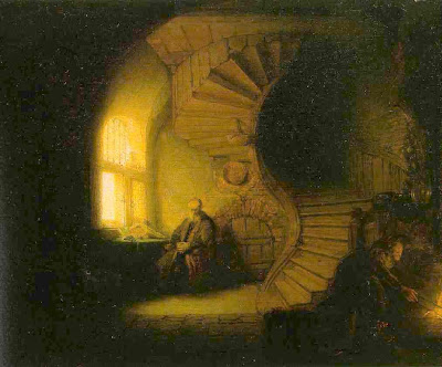
The first artist that comes to mind when i think of form, for some reason i think of Rembrandt, probably because he really had a good grasp of the idea.

The contrast of the light from the window attracts the viewers eye to the left side of the spiral staircase. This line is "S" shaped, wavy making it more playful for the eye than a straight line.
We see repetition with the steps and also with the arch shaped window, ceiling and arch shaped small door. The twist of the spiral staircase also creates arch shapes.

________________________________________________________________________

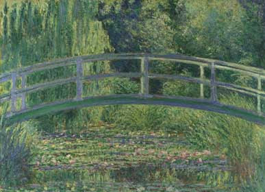
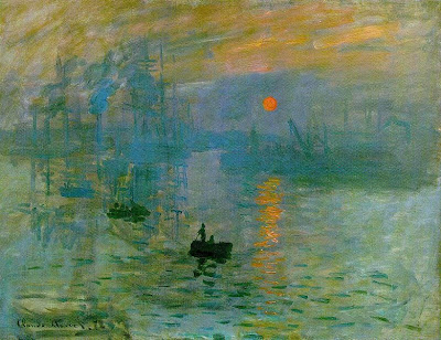
The "topic card" i picked was Impressionism, so i decided to study the form of some famous Impressionist artists pieces. Claude Monet is one of my favorite painters and I usually pay more attention to his use of color than form.


As a whole, Impressionist paintings are simple when it comes to brush stroke technique, detail is not imperative. Choppy strokes of color overlapping other colors creates forms of boats, people, water, and a reflection.


At the time of this movement new technology in art such as oil paints in tubes and retractable easels, made it easier for artists to work outside. Most Impressionist art is done outdoors.


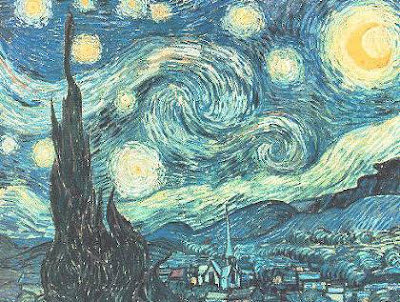
This is one of the most recognisable Impressionist pieces around. Van Gogh's Starry Night. He uses more imagination than accuracy here. We see use of repetition, playful lines and texture.

______________________________________________________________________

This is the piece of paper I was given to base my Impressionist work on, Yippee...

I fought with this assignment for quite some time. I went out and got a primed canvas, cut it from 9'x12' to 8 1/2 x 11 then cut a hole in the top left corner of the canvas board to represent the hole left from the hole puncher on this paper. Long story short, i got real frustrated and the impressionist piece i painted is no longer with us. It is destroyed and i literally went back to the drawing board using pastels rather than paint.


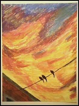
Since the impressionists were going outside and painting pretty pictures of Lily pads, gardens and landscapes in their area, i decided i needed to create something i see in nature. However, there is not much colorful nature on D and west 6th street in South Boston. The sunset and the sky rats (pidgins) in my neighborhood are the closest things to pure nature I'm going to find. And that will do just fine for me.
I used the lines I had to follow as a building and a electrical/phone wire. I used the rest of the open space to create harmony with color and movement. You may notice repetition in the shape the bottom left edge creates with the window, three sky rats, and also i revisited the shape of the birds in the clouds as well.


Tuesday, September 9, 2008

guerilla art


This was not my first guerrilla art experience, but it was the first time linoleum block printing since the 8th grade. I chalked the idea up as a success but the initial outcome was a failure, followed by a rendered save.

I spent a long time developing the concepts, carving the linoleum, and strategically picking effective locations for specific idea's. Gold, i was sitting on pure gold. I had a vision, a plan, and when it came down to the 5:00 AM attack everything crumbled. If I had more time, i would have used stencils (because they are easier to transfer on rough surfaces like ply wood, asphalt, and concrete). If i had more brains, i would have reversed my idea on the linoleum so that it didn't come out backwards in print.


This is my neighbor's house. Long story short, she was part of a lesbian love triangle, one of the other ladies got real angry and threw a Molotov cocktail though her front door. The lady who owned the house was not home but her 14 and 3 year old daughters burned to death on the 3rd floor. After the service master came by and cleaned out the building they boarded up the windows. Kids from all over the neighborhood come by to write to the two sisters on the boards. I had no connection to the family, but i have lost a few friends to freak fire accidents. So i can identify with the kids mourning. This piece is directed to the young friends of the victim's Someone told me "sadness + time= happiness." Over the years this theory has proved itself true, for me at least.


The linoleum press did not transfer on to the ply wood because of the rough texture of the wood. So i found a smooth surfaced electrical box on the street corner.


When i finally successfully transferred the image it came out reversed and made no sense at all.
I had to flip this photo so the design made sense, in real life its backwards


I grew up in a suburb 26 miles south of Boston and where i come from, we play basketball all-day-long. It's a small town that loves the game and most of the enthusiasm stems from my former high school coach. When i moved into the city 5 years ago i was excited to play at a higher street level than my hometown. I lost interest in the city street ball scene after 2 years because: (A) my life had been threatened 1 to many times on one particular court (B) I don't have much time between work, school, girlfriend and sleep (C) NOBODY PASSES THE F---ING BALL!!!

Sunrise at one of the baskets I used to play on...


Again, my great idea semi failed because it was reversed on the transfer. Its supposed to read: Passing is Greater Than Shooting(double meaning: better passing creates better shots/ pass on violent actions). This came out Shooting is Less Than Passing, which still works, but not what i had in mind. If you look to the left of the hoop you can see the first attempted stamp(i really wish i made stencils instead of stamps), the textured backboard didn't grab the ink too well. My friend who was helping me said the figure looked like an "Aborigine finger painting" so i dipped my finger in the block printing ink and finger painted the the image. I safely got my point across and that's all that matters, right? Dammit i wish i made stencils!!!

This is what the stencil (not the half assed finger paint print above it) was supossed to look like...


I'm not goin' out like a chump


I couldn't quit that easy and thought of this idea waiting at the bus stop. There was the water drain, right under my nose. There was a Jeep facing me across the street. Then it dawned on me


Water Drain


Jeep


Jeep Grill


Water Drain


Spongy roller and watered down, white, block print ink, done and done.